Minimalist Color Palettes for a Modern Future

The Philosophy of Less: Finding Depth in Fewer Hues

When you deliberately limit your palette, you reduce cognitive load and sharpen recognition. A single accent on a calm neutral base becomes a beacon, guiding the eye and creating memorable brand moments without shouting.

The Philosophy of Less: Finding Depth in Fewer Hues

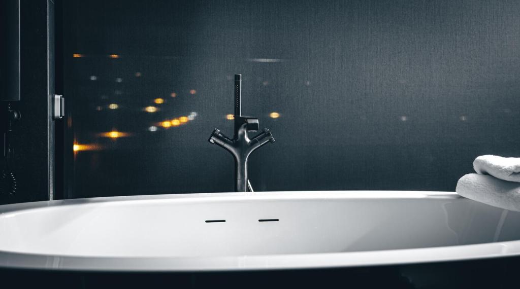
Whitespace is a partner to color, amplifying subtle tonal shifts. A near-white gray beside a rich charcoal can feel cinematic, allowing a carefully chosen accent to sing with quiet, purposeful drama.

The Philosophy of Less: Finding Depth in Fewer Hues

Color psychology still thrives with minimalism. A tranquil blue paired with warm sand softens tech products. A vivid coral against graphite energizes calls to action. With fewer notes, emotional intention becomes unmistakably clear.

Constructing a Future-Ready Minimal Palette

Start with dependable neutrals—soft gray, off-white, deep graphite—then choose one expressive accent. Let the accent handle highlights and actions while neutrals structure layout, rhythm, and legibility across every touchpoint.

Constructing a Future-Ready Minimal Palette

A minimal palette must read clearly. Target WCAG contrast ratios, like 4.5:1 for body text, using tonal steps rather than more colors. Micro-contrast preserves calm aesthetics while safeguarding accessibility and comfort.

Accessibility Without Aesthetic Compromise

Lighting conditions are unpredictable. Test your neutral text on varied backgrounds, verifying contrast with reliable tools. Consider a slightly darker neutral for text than you initially prefer, balancing visual elegance with everyday readability.

Accessibility Without Aesthetic Compromise

Never rely on hue alone. Pair your single accent with patterns, icons, or labels. Deuteranopia and protanopia simulations help ensure your minimal palette still communicates states, priorities, and meaning across diverse vision profiles.

Origins and Inspirations: A Short Journey

From Bauhaus to Brand Systems

Early modernists promoted reduction and purpose, shaping today’s systems thinking. Their emphasis on function and clarity inspires palettes that communicate without clutter, anchoring brand experiences in a few essential, well-chosen hues.

Scandinavian Calm, Japanese Clarity

Scandinavian restraint and Japanese simplicity share a respect for materials, space, and quiet detail. Translating that spirit to digital palettes favors neutrals, gentle contrasts, and a single accent that moves like a whisper, not a shout.

A Small App’s Pivotal Rebrand

One founder told us a two-color pivot saved their overwhelmed interface. Switching to graphite and a single mint accent halved support tickets, spotlighted actions, and finally gave their product a recognizable, reassuring voice.

Sustainable Choices Through Color

On OLED displays, darker pixels draw less power. A restrained, darker-leaning palette can incrementally reduce energy use at scale, aligning minimal aesthetics with practical environmental benefits without sacrificing clarity.
The 3–2–1 Palette Exercise
Choose three neutrals, two tonal steps for each, and one accent. Design a button, card, and hero. If something feels loud or muddy, adjust the accent’s saturation first, then tune your neutrals’ lightness.
Context Stress Tests
Preview your palette on light and dark backgrounds, in daylight and dim rooms, across phones and desktops. Screenshots and printouts reveal surprises, helping you refine without adding extra colors or visual noise.
Share, Iterate, Subscribe
Post your minimal swatches and mockups in the comments. Ask for accessibility and mood feedback. Subscribe for monthly palette critiques, step-by-step audits, and real-world case studies that keep your minimalism sharp and future-focused.
Kolhani
Privacy Overview

This website uses cookies so that we can provide you with the best user experience possible. Cookie information is stored in your browser and performs functions such as recognising you when you return to our website and helping our team to understand which sections of the website you find most interesting and useful.